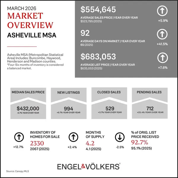
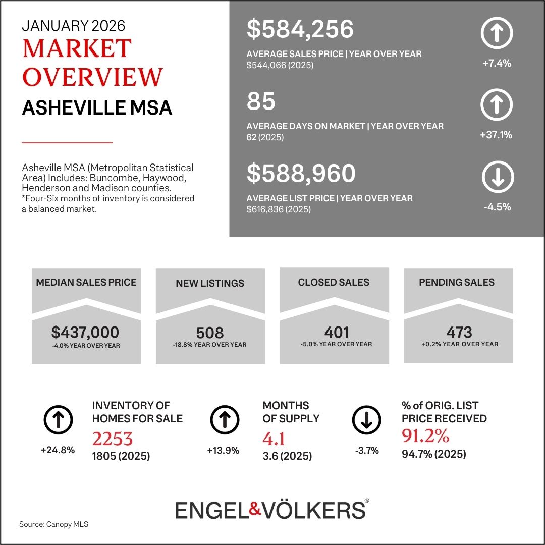
The first month of data for 2026 is in and nearly all of it continues to point to a buyer's market. The snapshot of year over year information is great but it's important, at least from time to time, to take a look at the longer trends. Below January's stat sheet I've included a few graphs to remind us where we've been over the years. Take a look for a little perspective.
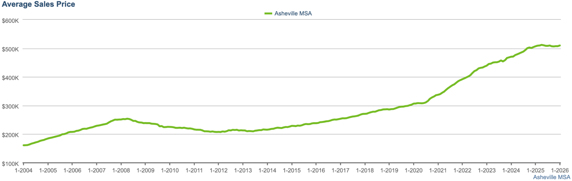
If you're looking at this on your phone you may have to zoom in to see the numbers but the general trends are what we're after. This first graph shows average sales price. Moving from left to right, the first crest was the lead up to the Great Recession and the trough after 2008 was the fallout. Then we got our feet under us and a "normal" rate of appreciation resumed through the twenty teens. Then the pandemic hit and sent us sideways for a bit - see the short flat part of the curve in early 2020? Then Asheville and surrounding areas caught fire as buyers from big cities and other parts of the country wanted more space, more amenities, a different lifestyle and an increased ability to work remotely allowed it to happen. Demand and prices went up fast, however, the last 12+ months we've leveled off due to a variety of uncertainty.
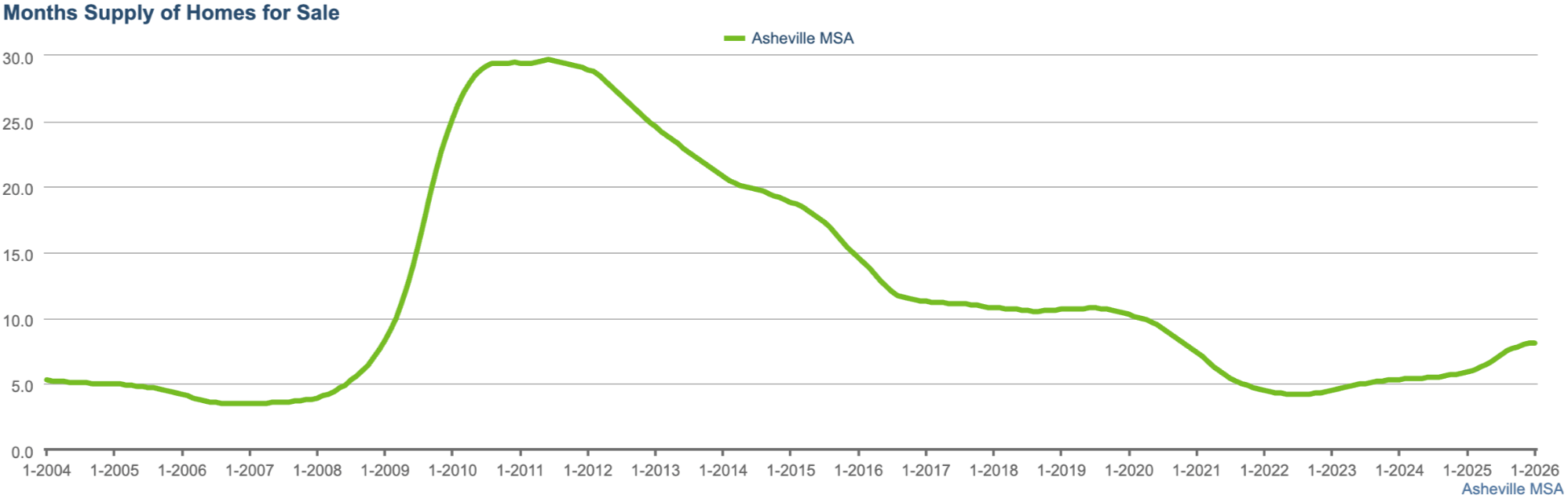
This next graph shows the month's supply of homes. Note that all of this data has been sourced from Canopy MLS for the four counties surrounding Asheville and I've set them to rolling 12 month averages. If you were to drill down to specific areas, zip codes, neighborhoods, price points, square footage etc etc you would find variations of these graphs, to some extent, as real estate can be hyper local.
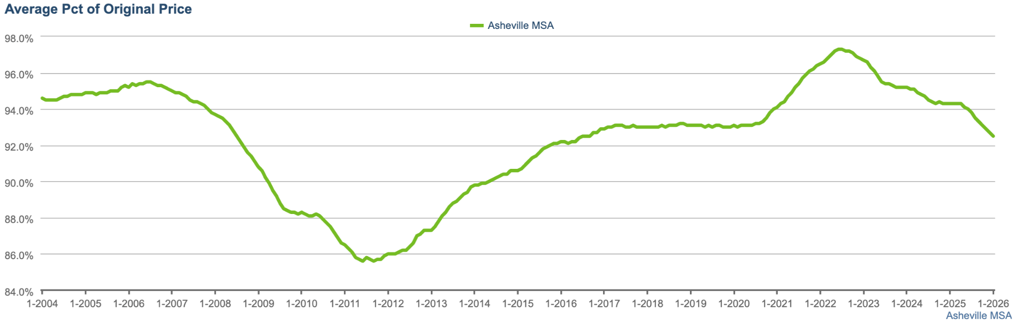
What's interesting, although not surprising, is the symmetry that runs horizontally through some of these graphs when they're brought together. This third graph shows the percent of original list price received which typically moves inversely to the supply of homes for sale. More homes for sale equals more ability for buyers to negotiate the price down. The opposite is also true. Easy to see with the graph above and the graph below.
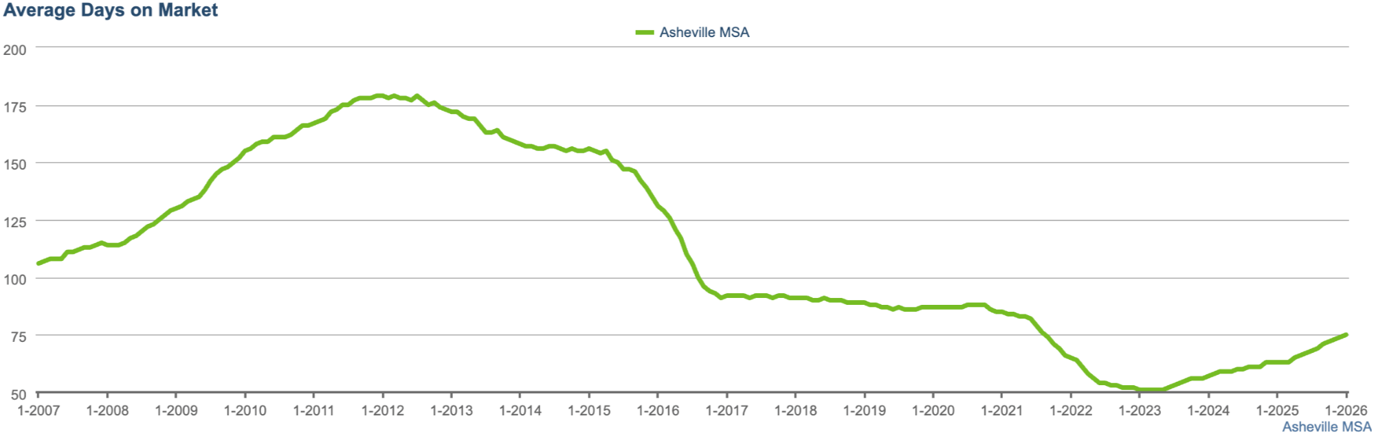
The final graph, average days on market, tends to run with the housing supply while moving somewhat inversely to the percent of original list price received. This makes sense - having lots of homes on the market will lead to buyers slowing down to find the one they want, aka higher days on market and lower price received.
I'll finish by saying there is no crystal ball as to where we're headed but, economic and geopolitical uncertainty aside, it does feel like we're headed back to the stable and balanced market of the twenty teens. I realize the word "feel" is not at all scientific or data backed but the fundamentals that make Asheville a great place to live and own a home are intact. Perhaps above all else, buyers and sellers need to have expectations that are realistic and in line with the current market.